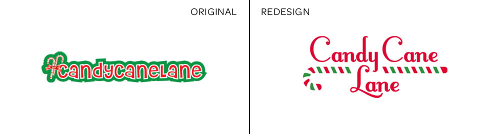
Candy Cane Lanelogo
Along with Spookytown, the ProductWorks Christmas sub-brand Candy Cane Lane also needed revision. The original was like fruit cake. It had too much going on, the different elements clashed and nobody liked it. It was too busy and not only did the multiple chunky strokes decrease legibility, they compressed the logo in a way that reminnded me of the stress and chaos of the holiday season. The goal of the redesign was to simplify the logo and make it feel lighter while still invoking warmth, nostalgia and whimsy.
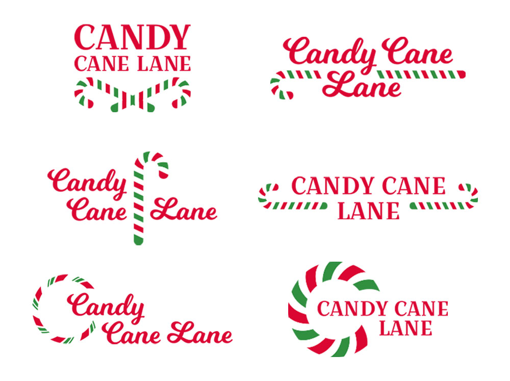
To begin with, I made multiple variations of an idea. Take a font that felt nostalgic and “Christmassy” and pair it with candy cane imagery. After experimenting with scale, layout, et cetera, I narrowed it down to a final two from which the final logo was chosen.